
Visualization with Power BI
Benefits of Power BI Visualization
By leveraging Power BI through MOST Programming’s expertise, businesses experience the following advantages

Real-Time Insights
Access up-to-date data in real time through interactive dashboards. Stay informed and act quickly with timely information.

User-Friendly Interface
Power BI’s visuals are easy to understand, even for non-technical users, enabling every stakeholder to make data-driven decisions.

Centralized Reporting
Consolidate data from multiple sources into one platform for a unified view of your business performance.

Tailored Security
Power BI’s security features allow you to define access levels, ensuring that specific individuals can only view relevant reports and data.

Enhanced Decision-Making
Visualizations uncover trends and opportunities in raw data, enabling informed, strategic decisions.

Scalable Solutions
Power BI is highly scalable, ensuring it grows with your business as your data and reporting needs evolve.

Cost-Effective
Power BI, part of the Microsoft ecosystem, integrates with Excel, SharePoint, and Azure, reducing costs and boosting efficiency.
Data Flow Architecture Services
In today’s data-driven world, organizations are flooded with information from multiple systems and processes. However, raw data is often overwhelming and difficult to interpret without the right tools. At MOST Programming, we specialize in Visualization Services using Power BI, a leading business intelligence platform that transforms complex data into clear, actionable insights.
Through interactive dashboards, reports, and visuals, we empower businesses to make faster, data-backed decisions.

What is Power BI Visualization?
Power BI is Microsoft’s powerful business intelligence tool that enables businesses to connect, visualize, and securely share data in a user-friendly format in real time. Visualization using Power BI involves creating intuitive interactive dashboards and reports that bring your data to life. Instead of sifting through endless spreadsheets or databases, stakeholders gain quick insights through visuals such as charts, graphs, and key performance indicators (KPIs).
MOST Programming leverages Power BI to help organizations unlock the potential of their data. Whether your data is scattered across spreadsheets, cloud platforms, CRMs, or databases, we transform it into meaningful insights that drive strategic decisions.

Our Approach to Visualization with Power BI
At MOST Programming, we follow a structured approach to deliver tailored Power BI visualization solutions:
- Understanding Business Requirements : We collaborate with your team to understand your specific business goals, key metrics, and reporting needs.
- Data Collection and Integration: Our experts connect Power BI to your data sources, whether they’re internal (e.g., SQL databases, Excel files) or external (e.g., cloud services like Azure, AWS, SaaS applications, and APIs).
- Data Modeling and Transformation: Raw data is often messy and inconsistent. We clean, transform, and model your data, ensuring it is ready for accurate analysis.
- Designing Custom Dashboards and Reports: We design dynamic, interactive live dashboards tailored to your needs. Using Power BI's advanced visualization tools, we create visuals that highlight trends, patterns, and KPIs, making your data easy to interpret.
- User Training and Deployment: We ensure your team can effectively use and navigate Power BI dashboards. With training and ongoing support, and through documentation we help you maximize the value of your reports and insights.

Why Choose MOST Programming for Power BI Visualization?
At MOST Programming, we combine technical expertise with a deep understanding of business processes to deliver tailored visualization solutions. Our team has extensive experience implementing Power BI across industries, ensuring each solution meets your specific needs.
- Customized Dashboards: We don’t believe in one-size-fits-all. Our dashboards are designed to reflect your KPIs, workflows, and goals.
- Seamless Integration: We connect Power BI to your existing systems for smooth, real-time data flow.
- Actionable Insights: Our visualizations are designed to go beyond aesthetics—they deliver actionable insights that drive measurable outcomes.
- End-to-End Support: From implementation to training and ongoing maintenance, we support your journey to becoming a data-driven organization.
In a world where data is abundant, visualizing it effectively is key to success. MOST Programming’s Visualization (Power BI) service transforms complex datasets into clear, interactive visuals that enable smarter, faster decisions. By turning raw information into actionable insights, we empower organizations to optimize operations, improve performance, and drive growth. Let MOST Programming help you unlock the power of your data through intuitive, real-time visualization. Whether you’re just starting with Power BI or need advanced dashboards, we’re here to guide you every step of the way.
FAQs Related To Power BI Data Visualization Services
What are Power BI data visualization services?
Power BI data visualization services involve using Microsoft's Power BI platform to transform raw, complex data into clear, interactive, and easy-to-understand visual formats like charts, graphs, and dashboards. These services help businesses identify trends, track key performance indicators (KPIs), and uncover actionable insights that might be hidden in spreadsheets or databases. The goal is to make data accessible and meaningful for decision-makers at all levels of an organization.
How can custom Power BI data visualization services benefit my business?
Custom Power BI data visualization services offer tailored solutions that align directly with your specific business goals. Instead of using generic templates, custom services create dashboards and reports that track the metrics most important to your operations. This leads to more relevant insights, improved decision-making, and a greater return on investment. A custom approach ensures the visualizations are intuitive for your team and integrated seamlessly with your existing data sources.
What kind of data can be used with Power BI data visualization services?
Power BI data visualization services can connect to a vast array of data sources. This includes everything from simple Excel spreadsheets and CSV files to complex databases like MySQL and other SQL servers. It also integrates smoothly with cloud-based data sources, such as Azure SQL Database, Salesforce, and Google Analytics, allowing you to create a unified view of your data from across your entire organization.
What is the process for creating a custom Power BI dashboard?
The process typically begins with understanding your business requirements and identifying key performance indicators. From there, data is collected and integrated from various sources. The next crucial step is data modeling and transformation, which is part of our Data Management and Optimization services, to ensure the data is clean and accurate. Finally, custom dashboards and reports are designed with interactive visuals, followed by deployment and user training.
How do Power BI data visualization services support real-time analytics?
Power BI data visualization services can be configured to connect to live data sources, enabling real-time analytics. This means that as your data updates, your dashboards and reports reflect these changes almost instantaneously. This capability is essential for monitoring time-sensitive operations, such as tracking sales performance, website traffic, or manufacturing output, allowing you to react quickly to emerging opportunities or issues.
Can Power BI dashboards be accessed on mobile devices?
Yes, one of the significant advantages of Power BI is its mobile compatibility. Dashboards and reports can be accessed through the native Power BI mobile apps for iOS and Android devices. This allows stakeholders to monitor key business metrics and access critical insights from anywhere, at any time, ensuring that data-driven decision-making is not confined to the office.
How do you ensure data security with Power BI data visualization services?
Security is a core component of Power BI data visualization services. Security is managed through role-level security (RLS), which restricts data access based on a user's role or department, ensuring that individuals can only see the data relevant to them. Additionally, Power BI leverages Microsoft's robust security infrastructure, which includes data encryption and compliance with numerous international and industry-specific standards.
What makes Power BI a cost-effective choice for data visualization?
Power BI is often considered a cost-effective solution because it is part of the broader Microsoft ecosystem, which many businesses already use. It integrates seamlessly with tools like Excel, SharePoint, and Azure. The pricing structure, which includes a free desktop version for individual use and a relatively low-cost Pro version for sharing and collaboration, makes it an accessible choice for businesses of all sizes.
How do data visualization services fit into a broader data strategy?
Data visualization services are a critical component of a comprehensive data strategy, acting as the final step in the data journey. They rely on a solid foundation of data collection, storage, and processing, which is established through a well-defined Data Flow Architecture. By presenting the processed data in an accessible format, visualization services make the insights generated by your data strategy available to the entire organization.
How can a business get started with Power BI data visualization services?
Getting started with Power BI data visualization services begins with identifying the key business questions you want to answer with your data. From there, you can begin to identify the necessary data sources. For businesses looking for a guided approach, partnering with a provider of Power BI services can help you develop a clear strategy, build effective dashboards, and ensure you are getting the most value from your data.


Data Visualization with Power BI Services: Complete Guide to Business Analytics Solutions
Introduction
Power BI Services represents Microsoft’s cloud-based business intelligence platform that enables organizations to transform raw data into interactive visualizations accessible from anywhere. As the online component of the Microsoft Power BI ecosystem, the service provides enterprise-grade capabilities for creating, sharing, and collaborating on data visualization projects across teams and departments.
This guide covers Power BI Service architecture, Power BI Premium tiers, and Microsoft Fabric integration specifically for data visualization workflows, and highlights the key features of Power BI Services that support effective data visualization. Content focuses on cloud service capabilities rather than Power BI Desktop modeling techniques, though we address how these components connect in enterprise deployments. Business analysts seeking to understand service-tier differences, IT professionals evaluating deployment strategies, and decision-makers comparing cloud-based BI solutions will find practical guidance here.
Direct answer: Power BI Services enable organizations to create visual reports, publish interactive dashboards, and share insights through a cloud-based platform that handles data refresh, security, and distribution without requiring users to download Power BI Desktop or manage local infrastructure.
By the end of this guide, you will understand:
- How Power BI Service differs from Power BI Desktop and when to use each
- Service tier options including Pro, Premium Per User, and Premium capacity
- Workspace architecture and collaboration features for team-based visualization
- Gateway configuration for connecting on-premises data sources to cloud services
- Security implementation and governance controls for enterprise environments
Introduction to Business Analytics
Business analytics is the discipline of examining business data to uncover trends, patterns, and actionable insights that drive informed decision-making. At its core, business analytics transforms raw data into meaningful information, enabling organizations to optimize operations, identify new opportunities, and achieve strategic goals.
Power BI, Microsoft’s robust business analytics tool, empowers users to connect to a wide variety of data sources and transform raw data into compelling visualizations. With Power BI, users can create custom visualizations—such as line charts, pie charts, and bar charts—to display data in ways that reveal deeper insights into business performance. The platform’s data modeling capabilities allow users to shape and relate business data, making it easier to analyze and interpret complex datasets.
Power BI offers a comprehensive suite of features for data preparation, data modeling, and data visualization. Users can create interactive reports and dashboards that not only present data but also provide the power to explore and analyze it from multiple perspectives. Whether you’re building a single report or a suite of dashboards, Power BI enables users across the organization to connect, visualize, and share insights, making business analytics accessible and actionable for everyone.
Getting Started with Power BI
Getting started with Power BI is straightforward, making it accessible for both new and experienced users. The first step is to download Power BI Desktop, a free application available from the Microsoft website. Once you download and install Power BI Desktop, you can launch Power BI Desktop and begin connecting to a wide range of data sources, including Excel spreadsheets, SQL Server databases, and various cloud services.
Power BI Desktop provides an intuitive interface for report creation, allowing users to import data from multiple sources and quickly create visualizations. The platform supports the creation of interactive reports and dashboards, enabling users to analyze data in real time and gain valuable business insights. With built-in templates and sample datasets, users can get started with Power BI quickly, learning how to create visualizations and build reports that meet their specific business needs.
As you become more familiar with Power BI, you can explore advanced features such as data modeling, custom visualizations, and integration with other Microsoft services. Whether you’re building your first report or developing a comprehensive analytics solution, Power BI offers the tools and flexibility needed to turn data into actionable insights and drive business growth.
Understanding Power BI Services for Data Visualization
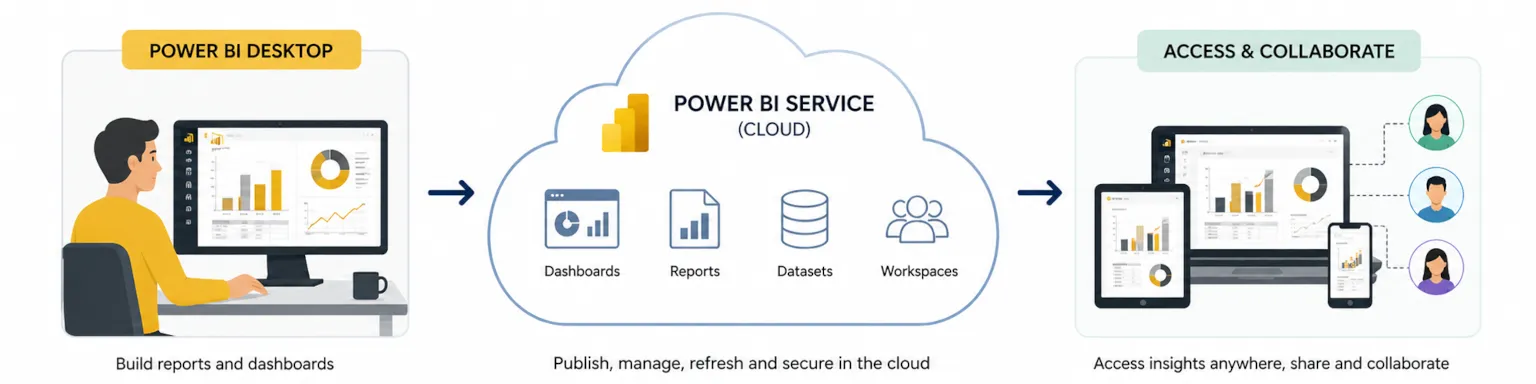
Power BI Service (app.powerbi.com) functions as the cloud-based consumption and collaboration layer within the Microsoft Power BI ecosystem. While Power BI Desktop serves as the primary authoring tool where analysts launch Power BI Desktop to build semantic models and create visualizations, the service handles distribution, scheduled refresh, and enterprise governance. Understanding this division clarifies where each tool provides value in the data visualization process. Power BI offers a variety of visualization types, such as bar charts and line charts, and selecting the appropriate visualization is crucial for effective data analysis and for achieving specific analytical goals.
Power BI Service vs Power BI Desktop
Power BI Desktop is a free Windows application you download Power BI Desktop to install locally. Analysts use it to connect to multiple data sources, transform raw data using Power Query Editor, build data modeling relationships, and design power bi reports on the report canvas. Desktop produces PBIX files containing both the semantic model and visualization definitions.
Power BI Service receives these published reports and provides the infrastructure for organizational deployment. Dashboards—single-page collections of pinned tiles from multiple reports—exist only in the service. The service also enables features impossible in desktop environments: scheduled data refresh, row-level security enforcement, workspace collaboration, and power bi mobile apps access. When you publish reports from desktop to the service, the semantic model and visuals become available to users throughout your organization without requiring them to have desktop installed.
Service Tiers and Licensing Models
Power BI offers three primary service tiers with distinct capabilities for data visualization workflows:
| Feature | Power BI Pro | Premium Per User | Premium Capacity |
|---|---|---|---|
| Monthly Cost | ~$10/user | ~$20/user | ~$5,000+ (capacity) |
| Data Refresh | 8 times daily | 48 times daily | 48 times daily |
| Model Size Limit | 1 GB | 100 GB | 400 GB |
| Paginated Reports | No | Yes | Yes |
| Deployment Pipelines | No | Yes | Yes |
| AI Capabilities | Limited | Full | Full |
Microsoft Fabric integration extends these tiers by unifying Power BI with data engineering, data warehouse, and real-time analytics services. Organizations using Fabric access OneLake storage directly from Power BI Service, enabling seamless visualization of business data managed across the unified analytics platform.
Cloud-Based Visualization Advantages
Moving data visualization to cloud services provides capabilities that local installations cannot match. Real-time analytics become possible through streaming datasets and DirectQuery connections that execute queries against source systems at interaction time. Power BI Copilot and other artificial intelligence features leverage cloud computing resources for ai generated reports and natural language querying.
Robust data security benefits from centralized policy enforcement rather than depending on individual user configurations. Sensitivity labels, row-level security, and audit logging operate consistently across all users accessing reports and dashboards through the service. These governance capabilities make Power BI Service essential for enterprise deployments where analysts need to analyze data while maintaining compliance requirements.
Core Power BI Service Components for Data Visualization
The service architecture centers on workspaces, apps, and gateways—components that organize content, control distribution, and maintain data connections. Understanding these main components helps teams implement effective visualization strategies. The key features of workspaces, apps, and gateways include streamlined content management, secure sharing, and reliable data connectivity, all of which support efficient data visualization and collaboration.
Workspaces and Collaboration Features
Workspaces function as containers for related power bi reports, dashboards, semantic models, and dataflows. Teams create workspaces organized by project, department, or subject area to group visualization assets logically.
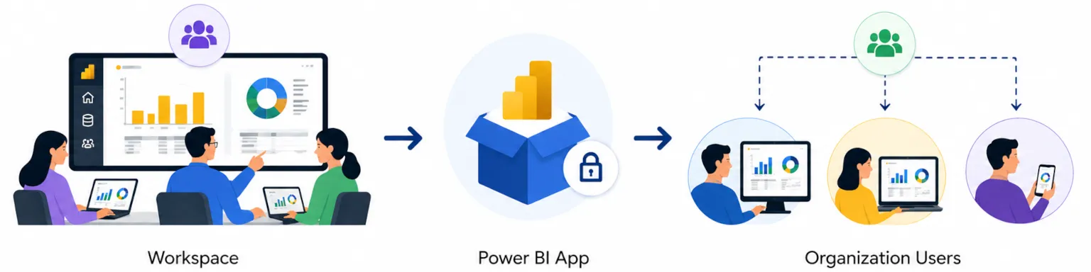
Role-based access control governs workspace permissions:
- Admin: Full control including membership management
- Member: Can create and edit content, share items
- Contributor: Can create and edit content without sharing rights
- Viewer: Can only consume published content
This structure enables collaborative report creation while maintaining governance. Analysts develop interactive reports in shared workspaces, receive feedback through comments directly on visuals, and iterate without email-based file sharing. Workspace settings control whether members can export data, build content on top of semantic models, or access underlying datasets—essential controls for organizations managing sensitive business data.
Apps and Distribution Mechanisms
Power BI Apps package workspace content into curated experiences for end users. Rather than granting direct workspace access, organizations publish apps containing selected reports and dashboards arranged in custom navigation. This separation between authoring environments and consumption experiences simplifies governance while improving user experience.
Template apps extend this model by enabling organizations to create reports that connect to common data sources like Dynamics 365, Salesforce, or SQL Server. Users install template apps and connect their credentials to display data from their specific instances. This approach accelerates deployment of standardized visualizations across various sources without requiring each team to build from scratch.
Gateway Services and Data Connectivity
Power BI Service connects directly to cloud services like Azure SQL Database, SharePoint Online, and hundreds of SaaS applications. For on-premises data sources, organizations deploy the On-premises Data Gateway—a Windows service that bridges local network resources with cloud-based visualization.
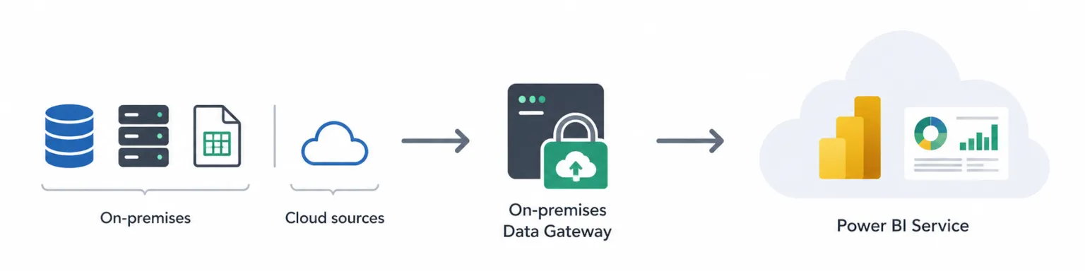
Three connection modes determine how the service retrieves data:
Import mode copies data into Power BI’s in-memory engine during scheduled refresh. This provides fastest query performance but requires sufficient capacity for the extracted dataset.
DirectQuery sends queries to source systems at visualization interaction time. Users see current data without importing data, but query performance depends on source system capabilities. This mode suits scenarios requiring real-time visibility into operational databases.
Live Connection connects to Analysis Services models (cloud or on-premises) without duplicating data storage. Organizations with existing enterprise semantic models often use this mode to add Power BI’s visualization layer to their existing investments.
Gateway configuration establishes which data sources connect to the service and who can use those connections for importing data into their reports.
Data Import and Preparation
Importing and preparing data is a crucial step in the Power BI analytics process. Power BI provides powerful tools to help users connect to a variety of data sources and prepare their data for analysis. The Power Query Editor is a central feature, enabling users to import data, clean and transform it, and shape it for reporting and visualization.
With Power Query Editor, users can connect to multiple data sources, including databases, cloud services, and files, and perform a wide range of data manipulation tasks. This includes creating custom columns, removing unnecessary fields, and transforming data types to ensure consistency and accuracy. The editor also supports advanced data analysis through the integration of R scripts, allowing users to enhance their data preparation and visualization capabilities.
Once the data is imported and prepared, users can create visualizations and build interactive reports and dashboards that provide meaningful insights into their business. Power BI’s seamless data import and preparation process ensures that users can quickly move from raw data to actionable analytics, supporting informed decision-making and business success.
Implementation and Advanced Service Capabilities
Enterprise Power BI deployments require planning beyond individual report creation. Service configuration, capacity management, and platform integration determine whether visualization investments deliver organizational value.
Service Deployment Strategy
Successful rollouts follow structured phases that build organizational capability:
- Tenant setup and administrator configuration: Establish tenant settings controlling features like export capabilities, external sharing, and Power BI Copilot access. Assign Power BI administrators and define governance policies before broad enablement.
- Workspace provisioning and user onboarding: Create initial workspaces aligned with organizational structure. Train workspace administrators on role management and content organization. Establish naming conventions and lifecycle policies.
- Data source integration and gateway deployment: Install gateways on appropriate servers with access to required data sources. Configure gateway clusters for high availability in enterprise scenarios. Register data sources and assign connection permissions.
- Security policy implementation and compliance setup: Activate sensitivity labels inherited from Microsoft Purview. Configure row-level security on semantic models requiring user-specific filtering. Enable audit logging and configure retention policies.
Service Tier Comparison
Selecting the appropriate service tier depends on organizational requirements across several dimensions:
| Requirement | Pro | Premium Per User | Premium Capacity |
|---|---|---|---|
| Report sharing | Pro-to-Pro only | PPU-to-PPU only | Any user can view |
| Large semantic models | Not supported | Up to 100 GB | Up to 400 GB |
| Paginated reports | Not available | Full access | Full access |
| Deployment pipelines | Not available | Full access | Full access |
| XMLA endpoint | Not available | Read/Write | Read/Write |
| Autoscale | Not available | Not available | Available |
Organizations getting started with Power BI often begin with Pro licenses for initial analysts, then evaluate Premium options as visualization demands grow. Premium capacity becomes cost-effective when organizations need to provide answers through power bi dashboard content to large user populations including view-only consumers.
Microsoft Fabric Integration
Microsoft Fabric represents the evolution of Power BI Service into a unified analytics platform. Fabric combines data integration, data engineering, data warehouse, data science, real-time analytics, and business intelligence capabilities under a single consumption model.
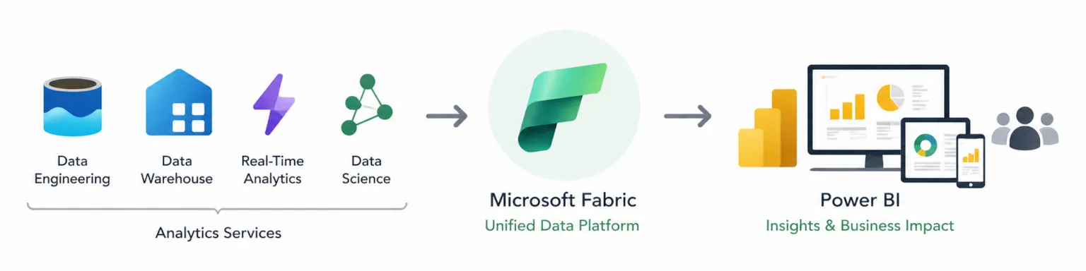
For data visualization, Fabric integration provides:
OneLake connectivity: Semantic models can connect directly to data stored in Fabric’s unified lake storage, eliminating data movement between analytics services.
Unified capacity: Organizations purchase Fabric capacity units that cover Power BI Premium, Synapse, and Data Factory workloads, simplifying licensing for comprehensive analytics.
Real-time intelligence: Fabric’s event streaming and real-time analytics services feed directly into Power BI visualizations, enabling operational dashboards with sub-second latency.
Organizations evaluate Fabric adoption based on their existing Azure footprint and requirements for unified governance across data engineering and business intelligence workflows.
Common Challenges and Solutions
Example: A common challenge organizations face when implementing Power BI Service is managing data refresh failures due to complex data sources. This can be addressed by optimizing data models and scheduling refreshes during off-peak hours.
Enterprise Power BI Service implementations encounter predictable obstacles. Understanding common challenges helps teams prepare effective responses.
Service Performance and Scalability Issues
Large semantic models and complex DAX calculations can degrade report performance. Premium capacity provides performance optimization unavailable in Pro tier, including larger model support and dedicated resources. Scheduled refresh windows sometimes conflict with business hours when users need current data.
Solution approach: Implement composite models that combine imported aggregations with DirectQuery for detail-level queries. Use Premium capacity’s enhanced refresh capabilities for incremental refresh of large datasets. Monitor capacity metrics to identify resource contention and adjust workload distribution.
Data Governance and Security Concerns
Organizations struggle to maintain consistent security across distributed report development. Without governance controls, teams create reports with conflicting metrics, sensitive data appears in inappropriate contexts, and compliance audits reveal gaps.
Solution approach: Implement endorsement (certification and promotion) programs that identify trusted datasets for organizational use. Configure sensitivity labels that flow from source data through to exported content. Enable information protection policies that prevent unauthorized sharing of classified visualizations.
User Adoption and Training Challenges
Self-service business intelligence succeeds only when business users can create visualizations independently. Many organizations deploy Power BI but find adoption concentrated among technical analysts rather than the business professionals who could benefit most.
Solution approach: Establish Power BI champions within business units who provide peer support and demonstrate relevant use cases. Create template reports that business users customize rather than building from scratch. Provide role-specific training covering the visualization pane, slicers, and basic filtering rather than comprehensive platform coverage.
Conclusion and Next Steps
Power BI Services transforms data visualization from a technical deliverable into an organizational capability. The cloud-based platform handles infrastructure, security, and distribution so analysts focus on creating visualizations that answer questions and provide actionable insights. Service tiers provide scalability paths from initial departmental use through enterprise-wide deployment.
To begin implementing Power BI Services effectively:
- Evaluate current visualization needs against service tier capabilities—determine whether Pro, Premium Per User, or Premium capacity aligns with your requirements
- Create a pilot workspace with a cross-functional team to establish governance patterns before broader rollout
- Schedule training sessions covering service-specific features like apps, gateways, and workspace management
Related topics worth exploring include Microsoft Fabric adoption strategies for organizations seeking unified analytics platforms, advanced Power BI Copilot capabilities for ai generated reports, and enterprise governance frameworks for managing self-service analytics at scale.
Additional Resources
Microsoft documentation: The Power BI Service documentation covers administration, deployment planning, and feature configuration. Start with the “Planning a Power BI enterprise deployment” whitepaper for comprehensive guidance.
Learning paths: Microsoft Learn offers role-specific paths for Power BI administrators, analysts, and developers. The PL-300 certification validates skills in data analysis and visualization using Microsoft Power BI.
Community resources: The Power BI Community forums and monthly community calls provide peer support and announcements about service updates. User groups organized by region offer local networking and shared experience resources.